
Mappa City
Cryptid Quest
How might we design an in-game user interface and game tutorial and that is helpful to players, without being intrusive?
Team
Eva Regelski Margaret Payne Rae Bernstein
Andrew Koo Shalyse Pierce
Role
Researcher, Designer, Tester
Timeline
3 week sprint
Tools

Figma
Procreate
G-Suite

Optimal
Workshop
Deliverables
-
High-fidelity desktop prototype for a tutorial and first 3 days of gameplay
-
High-fidelity mobile wireframes
-
Storyboards for lore
-
Site map
About Mappa
Mappa is a mobile first, web-responsive metaverse platform that gamifies the globe through location-aware social gaming. The Mappa founders brought our team on board prior to launch to help build out their go-to market product, which is a game called CRYPTID QUEST. This is a location-aware game where a player embarks on a quest to find creatures ‘never proven to exist’ such as Yetis, Leprechauns, and Bigfoot.
Our Proposed Task
From our original brief, we were tasked with creating both mobile and desktop wireframes to solidify the UI (User Interface) and establish flows and interactions for the first 3 days of proposed gameplay.
Mappa's priorities for the UI was to determine information architecture and provide an in-game tutorial for players.

Our Task
-
Solidify Game UI for mobile and desktop
-
Establish wireflows and interactions for first 3 days of gameplay

Priorities for UI
-
Information Architecture
-
In-Game Tutorial
Design Process

Our design process was broken up into 4 different phases - Discover, Define, Design, and Deliver. In this case study, I will take you through these phases and additional steps my team and I took to arrive at our final high-fidelity prototype.
Discover
Researching our target users and competitors
Methods Used: Competitive and Comparative Analyses, Heuristic Evaluations, User Interviews, Affinity Mapping
Not all of the methods we used will be discussed in this case study.
Competitive Analysis
Map UI for Superworld
We analyzed many of the competitors that Mappa had provided us with, however, the most notable one was a platform called Superworld. This is a virtual real estate platform mapped over the globe, which allows users to purchase real estate anywhere on earth.

Superworld's map demonstrates best practices for virtual maps, such as having an easy to use search bar; pinch, pan, zoom navigation; and allows users to click into areas to see more details about what's going on in those particular locations. This map UI would help influence our design choices for the map we would need to design, as it is an integral part of the game experience for a location-aware game.
Game Tutorial for Pokémon GO
For game tutorial and onboarding research, we chose to analyze Pokémon Go because it does a great job of showing players just enough to get them invested, teach them about the game, but still leaving enough room for them to explore on their own. Some of the key elements featured in their tutorial are explained below:

Goal: There is a clear goal in the beginning to give players context on the overall objective and story.
First Task: The tutorial launches players into an easy task very early on. This early foundational task can help increase engagement for players, as well as teach them some of the fundamental game mechanics and principles.
Guiding: This tutorial also features simple language and guiding instructions to non-invasively teach players game mechanics. This became an essential trait that we knew we needed to incorporate into our design.
Reward: After completing the first task, players are given an immediate reward to demonstrate the cause and effect of the basics of gameplay and to show how they can make progress.
Solo Exploration: Lastly, the tutorial does not explicitly point out where every single feature is before it sets players off into the world. It gives the basics, and trusts and respects players enough to not feel the need for extreme hand holding.
Heuristic Evaluation
Upland, Poptropica, Pokémon GO
We conducted a heuristic evaluation on some of Mappa's competitors. A heuristic shows how users solve problems in the fastest and most practical way possible. Since Mappa doesn't have a launched product yet, at this point in our research, we used this method to look at Upland, Poptropica, and Pokémon GO to determine their usability and to observe what worked well and where users ran into errors.
The most common areas where users were most likely to make an error were: User Control and Freedom, Recognition over Recall, Flexibility & Efficiency of Use, and Help and Documentation. We kept these features in mind as we formed our design solutions.
User Interviews
15 Participants | Ages 20-43 | 4 females, 10 males, 1 non-binary individual
We conducted user interviews with 15 participants to further understand what gamers like to see in game UI and their tutorial preferences and experiences. Below are the 4 main takeaways we learned from talking with our target users.

1. The majority of users fall into one of two categories:
-
Players who primarily play games to escape reality and for relaxation purposes. These players often play while multitasking.
-
Players who game for the purpose of socialization, excitement, and lore.
2. Players want a tutorial that has minimal interruptions, but also has the option to toggle the tutorial off if they prefer to jump straight into gameplay and learn on their own.
3. Players want to feel that they are progressing and overcoming large or small challenges.
4. Players enjoy variety in their gameplay, especially the balance of challenge and the ability to complete a task.
Understanding the Users
In an effort to learn more about the needs and concerns of our targeted users, we developed two proto-personas as a guide for our redesign.
Brian, The Bard

Age: 29
Location: San Francisco
Occupation: Realtor
Behaviors:
-
Competitive
-
Prefers desktop over phone
Goals & Needs:
-
Save a track progress
-
Quick gameplay
-
Quick learnability
Frustrations:
-
Tutorials that slow progress and prevent engagement
-
In-game purchases that are too expensive
-
Daily required tasks that restrict gameplay
Brian is a realtor who enjoys a grand story that emerges from a community of players. Per Quantic Foundry, a research company focused on gamer motivations, a standard Bard player is a team player who wants to chat with other players in worlds that are rich with stories, discovery, and customization.
Brian wants to be able to save and track his progress across multiple devices. He doesn't like to complete daily tasks in order to progress in a game, but he does like to be notified when he gets daily rewards and have the option to complete tasks as he pleases.
Gil, The Gardener

Age: 31
Location: San Juan, Puerto Rico
Occupation: Sales Rep
Behaviors:
-
Busy work life
-
Newly relocated
-
Able to multitask
Goals & Needs:
-
Stay connected with friends
-
Easy accessibility
-
Explore new environment
Frustrations:
-
Long tutorials interrupt their relaxation time
-
Too much direction or complex stories
Our secondary persona is Gil, a sales rep who is new to Puerto Rico. He wants to stay in touch with his gamer friends in the States, but isn't quite sure how to do so yet. Per Quantic Foundry, a Gardener is a player who is looking for quiet, relaxing, task completion games.
Gil enjoys accessibly gameplay that focuses on task completion and obtaining collectibles. He has a busy job and needs a game to help decompress while socializing with friends. He wants to be able to get past tutorials quickly and pick up the game on mobile during lunch breaks.
How Might We?
After synthesizing our research, we started to brainstorm some of our key focuses for this project:
How might we design a relaxing and engaging web-responsive game that allows users to start playing immediately and retain users?
How might we design an in-game tutorial that is helpful to users, without being intrusive?
The Problem
Those questions above led us to our main problem statement which is:
Users need a way to quickly and easily learn how to play Cryptid Quest, so that they can immediately start making progress, have fun with friends, and relax through immersive gameplay.
Project Considerations
During our process, it was important to consider both the business goals and user needs while keeping our constraints in mind. Beginning with the constraints, from our initial brief, we knew that we were designing a web-based game and had a style guide to follow.
The goals laid out from Mappa were a simple game UI and a well-designed tutorial. Mappa also wanted to see how the game would look on both mobile and desktop.
Based on our user interviews and research, we found that users need an engaging game with a captivating story.
Design
Our Solution Approach

Our research and data synthesis allowed us to identify 3 initial solutions to address both business goals and user needs. We decided to focus on the tutorial, in-game information architecture, and how to engage users through the progress building as they play the game.
Game Tutorial
What should game tutorials accomplish?
As we began thinking about the flow and design of the tutorial we'd be building out, I really wanted to make sure we kept our initial research in mind. This especially included our user interviews and best practices found through our competitive analyses.

From our research, we knew that a tutorial needs to hold several things true for it to be considered a "perfect tutorial." It needs to be able to teach the player how to play the game, of course. On top of that, it needs to comfort the player, because if the player enters the game and feels confused the entire time then they're not going to want to keep playing.
Tutorials are also in the very beginning of the game, so you have to excite the player so that they keep playing. Lastly, the thing that most tutorials disregard, is that they don't respect the player. This is the reason that a lot of people dislike tutorials. A good tutorial needs to respect the players intellect and treat them like an actual human being.
Sketches
Game Flow
As we moved on in our process, I led our efforts throughout the design phase. I began by synthesizing everything we've learned thus far and sketched out some ideas for the flow of the tutorial, keeping in mind those 4 areas of teach, respect, comfort, and excite. Based on Mappa’s direction, we broke our the tutorial into the first 3 days of gameplay which takes the player through completing their first quest. Our goal was to use this design studio to flesh out a tutorial that leads and teaches the player, but is still exciting and offers some opportunity for independent exploration.
Day 1 Flow
.png)
The first day is focused on onboarding, telling players about the game, what quests are, what a helper is, and how to use a helper to aid you during quests.
Day 2 Flow
.png)
Day 2 is centered around things that you can do while you’re not actively searching for quest clues. In these sketches, the helper is returning with a clue and money. After this, players can go to the shop to buy an item and equip that item on their character.
Day 3 Flow
.png)
Day 3 starts off with the player finding the last clue for the quest, which directs them to complete the quest by playing a mini game and then collecting their reward.
While we made a few alterations to the story and the flow of the game, for the most part, this storyboard ended up being the core of the experience we built out and tested.
Information Architecture
Hybrid Card Sort
41 Participants
Based on the user research data we collected, and business goals, we had an initial sense of best practices for game information architecture, but wanted to test if our assumptions were true.
We conducted a hybrid open/closed card sort with 41 participants which allowed users to show us how and where they would organize different features and controls of the game.

System Preferences
On-Screen UI
Main Menu


This card sort validated most of our assumptions of the game architecture and helped us solidify the 3 main areas where everything is located.
Game Site Map
Based on the card sort results, game UI best practices, and client needs, we created 3 main areas where all items are housed.

Main Menu Button
The first area being the main button where everything in the main menu lives. This includes Friends, Shop, Profile, Quests, Inventory, and Helpers. These are all features that will be accessed often during gameplay, which is why they live in a quick access area.

System Preferences
The second area is system preferences, where players can logout, access account settings, customize their controls, and toggle the tutorial on and off as needed.

Located on Screen during Gameplay
Finally, we have the on-screen items that will be visible to players at all times. In this area, we included world map access, a skip tutorial option, and a communication hub. We wanted these buttons to be quick and easy for players to access, but not intrude on their gameplay.

Mid-Fidelity Wireframes & Prototype
Combining all that we accomplished during our research phase and design studio, we started to design for mobile, and since this is a web responsive game, we eventually moved to desktop for our final prototype.

Our initial mobile wireframes showcase the user flow from Day 1 of the game through Day 3. A few of our key wireframes are shown here. Starting from the left, you’ll see the street view, the opened main menu, one of the tutorial screens, and a helper’s profile. We prototyped the user flow from Day 1 to 3 and conducted usability tests on it.
Usability Testing
10 Participants | Mid-Fidelity Mobile Prototype
These usability tests were done using our mid-fidelity mobile prototype. We broke up the test into the first 3 days of gameplay and had players complete tasks for each day, ranging from walking through the tutorial, navigating the map, finding a clue, buying items from the shop, and eventually completing their first quest.

Day 1 Tasks:
-
Create a new account
-
Walk through the tutorial
-
Find the main menu
-
Return to your main view
-
Map navigation
-
Navigate to your quests
-
Learn more about a quest
Day 2:
-
Login and explore
-
Collect loot
-
Visit the shop
-
Visit your inventory
Day 3:
-
Login and explore
-
Find a chest and collect items
-
Complete Yeti quest
Usability Metrics
With our usability tests, we collected 3 main types of data: Quantitative data, which included an error rate; Qualitative data, where we asked questions regarding overall satisfaction; and finally, we collected survey responses which gave us a usability score and more written feedback.

Usability Test Results
Average Error Rate (%)

Overall, our usability tests yielded the following results:
-
On average, users completed tasks without any issue 76% of the time
-
15% of the time, users completed a task with only a minor issue
-
It’s important to note here that 6% of the tasks that were completed with a major issue, and 3% of tasks that ended in failure. These would remain our areas of focus going forward.
Success Rate by Task

This graph allows us to identify specifically which tasks were problematic for users to complete. As you can see, shown in light and dark red are the tasks that were more difficult for users to complete without major issues or ending in failure.
Knowing which specific tasks were causing issues helped us understand which areas to focus on improving for further iterations.
Results

In addition to our no error success rate, our usability testing produced an average error rate of 8%. While this lands within an acceptable margin of error, there is clearly still room for improvement.
From our survey, we calculated a usability score of 66/100. This told us that while users could navigate and complete tasks with few errors, there were still improvements that could be made to make the system more enjoyable as well as more usable.
Usability Test Takeaways

-
Easy to use
-
Quick to learn

-
Unclear on game goal and overall story
-
Game UI: Bottom of screen is cluttered
-
Tutorial flexibility
The main points that we took away from our usability test results were that the game UI was fairly easy to use and the tutorial allowed the game to be quick for players to learn.
Some of the things that need improvement were that players felt confused on the overall story and goal of the game. The bottom of the screen was also a bit too cluttered, which ended up causing some confusion around where the main menu button is. Players also expressed interest in wanting some flexibility with the tutorial. This includes both adding the option to skip the tutorial for players who prefer to figure things out on their own, as well as the option to go back to previous tutorial screens in case they go through them too quickly.
Key Changes
Before we get into our final prototype, we wanted to highlight some key iterations that we made based on our usability test results.
Game UI
Mobile
First, I’ll walk you through our UI changes before we get to the tutorial changes.

Since we learned that users were having trouble locating the menu button, we really needed to focus on decluttering the bottom of the screen in order to prioritize the main menu, which players will be needing to use most frequently.
However, this meant that we would need another place to house communication features. We ended up replacing the notification bell in the top left corner with a communication hub, where players can message friends, access voice chat, and use emotes. Their notifications will all be coming through this hub as well.
Mobile to Desktop
As mentioned before, due to the fact that this game is a mobile-first platform, we wanted to build out the mobile design and test it before we adapted it to desktop. Now, you’ll be seeing some of the key changes that we made when converting the mobile version to the desktop version.
Desktop Game UI Changes
Before we get into our final prototype, we wanted to highlight some key iterations that we made based on our usability test results.
The Main Menu
Desktop

Since there is a lot more screen real estate on desktop, it didn’t make sense to keep the menu as one button on the bottom of the screen, as we had it on the mobile version. In order to fully utilize the width of the screen and minimize distraction, we placed the main menu functions and settings in a side menu bar on the left. Players can choose to keep this bar either open or closed as they play the game.
Built Out Chat
Desktop
The communication hub has come a long was from a simple, text-input bar on the bottom of the screen. This update is also included in our mobile wireframes, but some of the key features are built out a bit further in our final desktop prototype here.


You can see what it looks like when you’re getting an incoming message above. Players can choose to quick reply to the message right there. When players click to reply, it shows some of the previous messages in the conversation.

Tutorial Changes
Since one of the main things we learned from usability testing is that players were confused about why they’re going on these quests to find cryptids, it was very important to re-work the intro story in order to make the objective and purpose a lot more clear.
Story
Below is a video going through our intro story where we focused on making sure that players knew a few key things:
-
What cryptids are
-
Why players need to find them
-
Why you’re finding clues in obscure places like your hometown
-
How to go about finding cryptids
-
And finally, introducing helpers into the story
I really wanted to make sure that all of these screens of text are right in the very beginning of the tutorial. This is because the more that people are getting into the flow of playing the game, the more annoyed they'll be if a wall of text pops up. This is why it’s always best practice to get screens of text out of the way as early as possible. By introducing these crucial bits of information in as little screens as possible in the very beginning, we are able to teach the player their objective, while also exciting them about their new journey and set the tone of the game.
How do we respect the player?
So next we needed to think about how we respect the player. How do we teach users certain actions while also acknowledging the fact that they have a brain?

Throughout the tutorial, we have included small elements to help guide the player along if they get stuck. In this frame here, you can see one of the first tasks is to deploy your helper. More experienced gamers like our persona, Brian, may have the intuition to know exactly where to look for this feature. Other players like our other persona, Gil, may not, so its important to have some guiding elements, but the crucial thing here is that they need to be non-invasive so that they do not interrupt gameplay. So we did that with little gestures where needed throughout the tutorial.
We’ve also included skip tutorial buttons and back arrows for players in order to allow for more flexibility.
Prototype in Action
See our final, high-fidelity prototype in action! I've separated out the tutorial and first quest playthrough into our proposed first three days of gameplay.
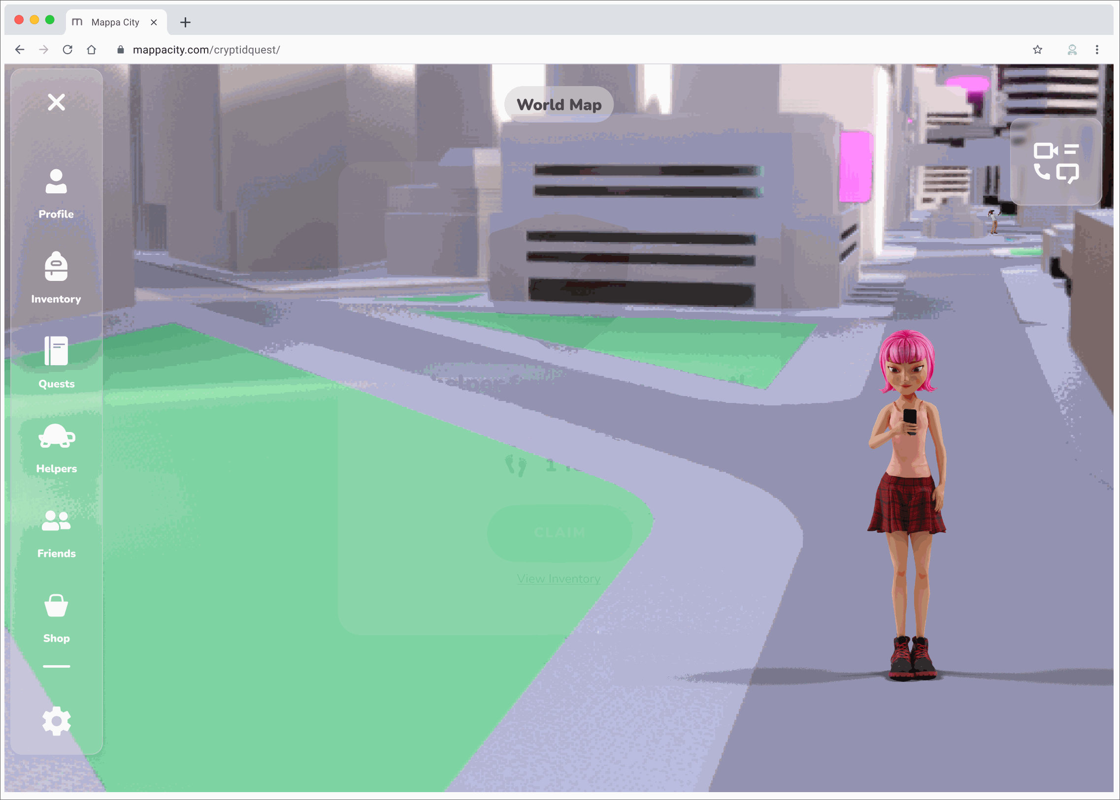
Day 1
Intro and Deploying your Helper
This first day of gameplay is centered around onboarding players and explaining the objective of the game. It also tells players what cryptids are, what quests are, and introduces helpers to the game. This day also has players walk through some of the main game mechanics so that they can get used to where things are on screen.
Day 2
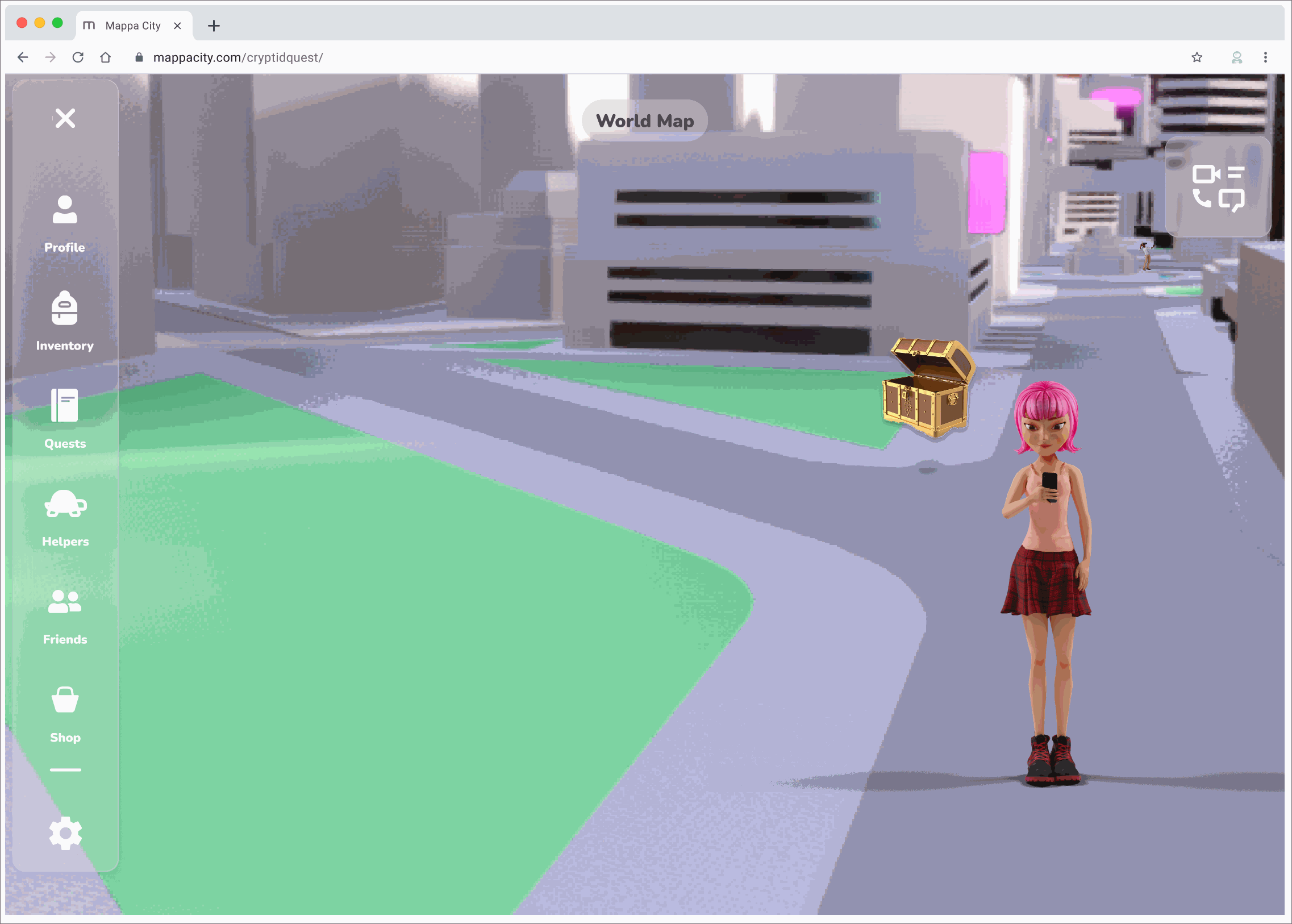
Buying Items and Chatting
The second day of gameplay is focused on the things you can do while you're not actively working on completing a quest. Below you can see a players helper return with coins. The game then prompts you to go to the shop for the first time. The player then buys an item and equips it. This day also introduces the in-game chat feature so that players can keep in touch with their friends.
Day 3
Finishing the First Quest
Day 3 starts off with the player finding the last clue for the quest which directs them to complete the quest by playing a mini game and then getting their reward.
Next Steps

A / B testing on mobile & desktop
Expand on Cryptid Lore
Conduct usability testing for wallet intergration
Moving forward if we were to continue working on this project we would conduct testing on our desktop prototype, as well as A/B testing for mobile and desktop to ensure the user experience remains the same across both devices.
We would also further expand on Cryptid Lore and hopefully bring more emotional investment from players because of it
Finally, we could conduct usability testing for wallet integration to understand how the addition of the wallet and cryptocurrency affects gameplay